The baseball redesign is finally live! You can check it out by visiting Ottoneu and checking out your leagues and teams. It’s been in the works ever since the football redesign ended, and I have to thank the hardworking folks at thoughtbot for their support and guidance through this whole process.
I started building this site in 2005, and baseball has reflected a design that I hacked together since then. We launched in 2011 with that design, and this is the first refresh to baseball in the 6 years since launch. I’m really proud of what the team has put together, and I think you’ll all really enjoy the new experience.
Please check everything out, and use this thread to let me know if you see any issues or bugs. Thanks so much for your support, and have fun this season!
EDIT: I’m keeping an eye on the feedback, so keep at it. I’m also keeping an eye on posts that have a lot of likes, so click the ‘heart’ if someone already captured the sentiment you have.
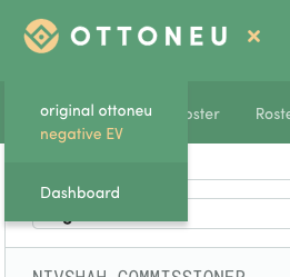
I’m not seeing the ottoneu logo on the league pages at all now, and I also no longer see the league/team drop downs (a feature that has become indispensable for me!)
If I delve into my team page, or watchlist, or anything that deep, there’s not a link to quickly take me back to the league home page or the dashboard (unless it’s obvious and I’m just missing it, which is entirely possible.)
Just some things… I am having trouble reading the text with all the white, would it be possible to bold more of the words? Specifically the green text is harder to see than it was previously. Also, I am getting an issue with words overlapping in the banner at the top announcing new trades. Don’t think there is enough height for each line as the underlines for each team name are overlapping the team on the next pending trade.
It’s just so…bright? The white background is so bright compared to the faint/thin text of names on the screen make it almost unreadable…the font looks like the original typewriter font. I get why it was redesigned, but it looks like I’m staring at Microsoft Excel trying to read spreadsheets with varying readability on team pages. It honestly looks like a wireframe of a website as opposed to the finished version, and I’ve done the hard refresh. Love the new navigation at the top and the drop-down where you can select the team is excellent. But it looks half done, where the colors at in the header made the move, and the rest of the page was left as a blank space for filler.
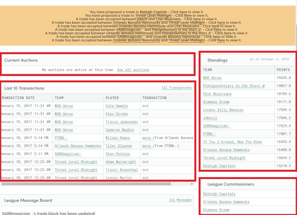
Specifically behind the areas I have outlined in red, I think adding some form of color, or a bolded text would be extremely useful. These areas are, really, separate parts of the site. Currently, they do not appear that way, so something to distinguish them would be very helpful @niv