I like the design…I just find it too bright.
Unless, since it’s cool to play Ottoneu, you want us to wear shades while we do it. 
Thanks for all the work…
I like the design…I just find it too bright.
Unless, since it’s cool to play Ottoneu, you want us to wear shades while we do it.
Thanks for all the work…
Also, on the team page: The trade block note… Wrapping text would be very helpful.
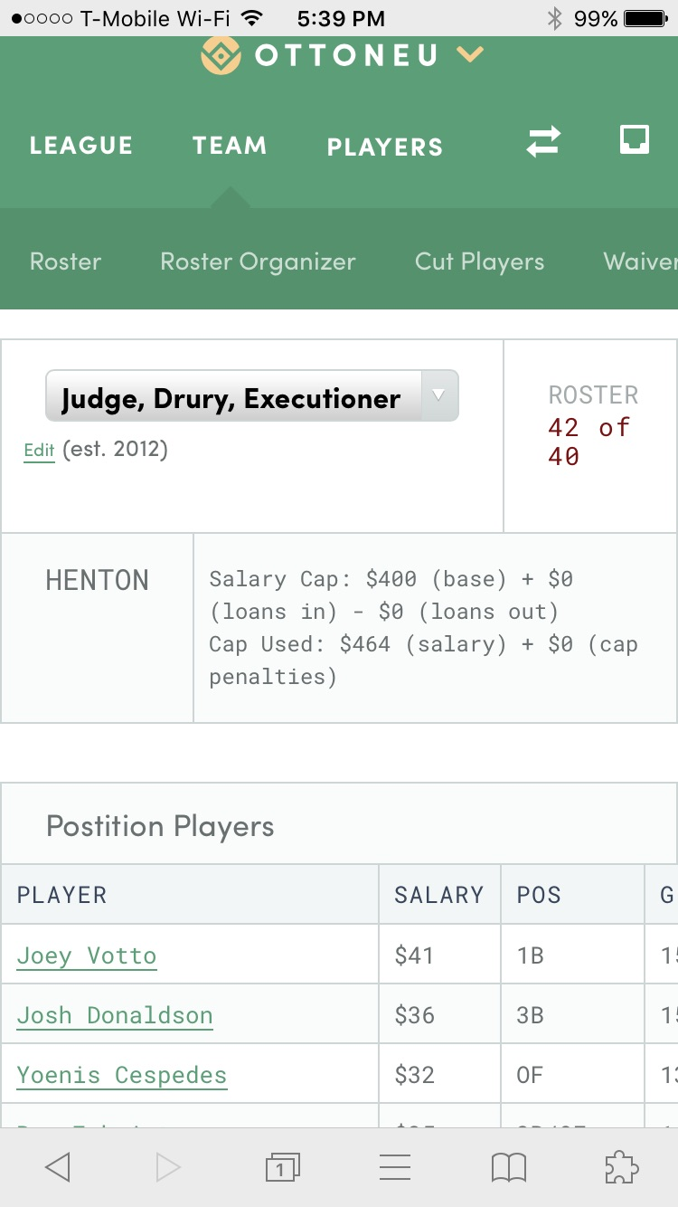
Click Trade at the banner at the top. Then initiate trade on the drop down.
I agree with those that would like to see more contrast or a bolder font. As it is right now it is pretty bright and I can’t look at it for very long. But I do appreciate the effort and time that went into this redesign to make a lot of features more intuitive.
Some initial observations:
The ability to mouseover the headings to reach desired pages would enhance the user experience. Too many clicks are required to navigate right now.
Too much empty orange and green space
Fonts should be black or least very dark to improve readability
The typewriter font makes the design feel dated
The spacing is stretched too far to the edges of the page and the line spacing in the proposed trades/accepted trades space is too crammed
I’m really liking the new design, it feels fresh and up to date. I actually appreciate all of the whitespace, it makes the site feel easier to read. I’m a fan of the color scheme and how it works with the football site, etc as a brand. I do wish the grey typeface color and green text link color were a good deal darker.
The organization of the menu strikes me as a huge improvement, its much more intuitive. And love the updated logos too.
I too can barely see it on my computer and phone. The font is too light. And the messages seem odd now and there should be initiate trade on team pages. But aside from these qualms I like the new changes alot. Now everything isn’t hidden under two headings! Please make it darker and easier to see on phone though
Outside of brightness/contrast messaging is really bad and is pretty much broken right now, but those are my only two gripes
Where is the tab for messages between different teams? Am I just missing it?
I agree with sakiehl’s observations. This Courier typeface is pleasing somehow, but the two colors are too light. I’d try #333 instead of #999 or whatever it is, for instance. I’m a graphic designer, fwiw.
A minor annoyance that has carried over from before… the Notes pop-up on the Watchlist has a really tiny window height, requiring a manual resizing everytime. Why doesn’t it automatically size to the length of the note you put in there?
Its the message icon in the navbar, no text. If the top line of your navbar isnt showing up you just need to refresh - CMD/CTRL + SHIFT + R
While I appreciate all the work that goes into ottoneu and love that it is unique I would love to just go back to the old format. I agree with the sentiment that everything is far too bright and I can’t read player values or hardly any fonts. I really appreciated the old site and the robust colors now I feel like I am on flea flicker.com which I don’t use because of how bad it looks. With how thorough ottoneu is I think it is imperative to really be able to see things clearly. I very much dislike this update
@nivshah, example below…
Two ideas that I think will have a big impact:
The use of “Roboto Mono”, monospace as the default table font-family is what I think is triggering a lot of the criticism about the lightness of the font. Change that font-family to the default fonts and the matrix content is much more readable. Go with the proportional font.
There’s a lot of content on the team pages. I wouldn’t restrict the content width to 65% on wide screens. Let the flex-layout grow to fit the available browser width.
Thanks. It’s a really refreshing design update. Really like it. Just hope it can continue to evolve.
@niv Love the redesign! The functionality is wonderful. Two issues:
The font could stand to be a bit darker.
The “Help” link at the bottom of my league homepage links to the Football help page, not the baseball one.
Looking at light type on bright bright white background like looking at small birds flying into sun.
As has been mentioned multiple times already, the font color absolutely needs to be darkened. It’s extremely difficult to read the text without straining my eyes. Also the alternating colors for multiple rows do not have enough differentiation. The design has potential but this still needs a lot of work.
How do I update my trade block? It is only visible from the roster page bit I no longer see a link to view/update the Trade Block.
Just realized on phone it no longer says when trade block was last updated. That was an important feature I think.
Just noticed it is on the team page. It still was nice to see on trade block page
Is there currently an issue with sent/received messages being duplicated?
While I love some of the functionality of the new site - especially the trade pop-ups, the color scheme and font choices make it difficult to read - a little too much white and spreadsheety