I am personally not a fan of the new design. I would rather have it back to what it was. This new one is slightly overwhelming and harder to navigate. The messaging is also not working. It keeps resending message’s and not clearing the yellow dot once you read the messages.
5 Likes
Yes, please revert back if at all possible or at least give us the option. It may impact me playing in the future.
3 Likes
Great work on the redesign Niv, looks great - a big improvement, although I agree that the green font could be slightly darker.
One note though - the FAQ section seems to have gone, and I think this was the only place that spelled out the FGPTs and SABR scoring?
1 Like
alright its not bad. I just don’t like the typewriter font. makes it look so old fashioned. Maybe we could try the font thats used in the top menus?
also it doesn’t list when owners last updated their trade block on the trade block page. I know it says it on the team pages but, would like to have it back.
Good work on this Niv
1 Like
I share both the kudos for the hard work and the critique of the contrast / washed out appearances and lack of visual weight. Two points that have perhaps not been made quite yet:
-
When I click over to a player’s page on the main FanGraphs site, I almost breathe a sigh of a relief. The darker main font, greater contrast, and more compact presentation is viscerally easier to look at. I wish the new Ottoneu page could split the difference between old ON / current FG design and the new ON design.
-
I know there are ALWAYS hoots and hollers when web pages are redesigned at first, and Niv and the designers need to have a vision and stick with it. People are pretty good at adapting and what looks weird today will be normal in a few. That being said, I also appreciate Niv asking for feedback and hope that the design team takes seriously the consistency of feedback in a few of these areas regarding contrast and font weight and make some adjustments.
5 Likes
To piggyback on point one, I removed the font-family style from the table element, and I think it looks so much better.
Could still use a darker hue though, even bold as some suggested:
6 Likes
Also having issues with messages - some are being duplicated, and no messages are being marked as ‘read’ after I look at them.
2 Likes
This is a major issue for me. I access ottoneu very frequently on my phone and this problem makes it much more difficult to do so.
2 Likes
Yes, this looks fantastic!
Good point. There’s plenty of vertical space for text wrapping. The single-line approach is less readable and forces a horizontal scrollbar and breaks the page grid.
In addition, I’d like the text block to be editable in place on the Roster page.
1 Like
Navigation issue (TODO?): On the Baseball Dashboard page the “Help” link goes to Ottoneu football. (https://ottoneu.fangraphs.com/football/help/). There doesn’t seem to be a parallel help page for baseball.
If I log out and go to the ottonue front page I see separate navigation for baseball, football, fangraphs, sign in. If I click on baseball I get a # response: https://ottoneu.fangraphs.com/#
Same here - Messages are being duplicated and not marked as read.
1 Like
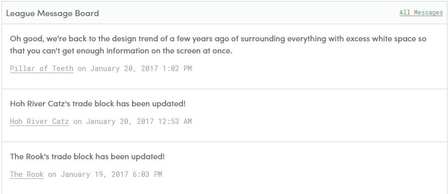
I never like adding more white space around text. I want to get as much information on a screen at once, and having a few extra pixels above and below every single line does nothing for me. The messages on the front page are the worst:
Again, I’m really only talking about vertical space, I’m betting horizontal spacing has more demands placed on it.
2 Likes
-
The design is nice, clean and simple, and I am a fan.
-
Working in tech, when you redesign things, there are always a lot of complaints. These complaints tend to fall into two camps - “I DO NOT LIKE THIS” which usually relates more to not liking change in general and those complaints often fade; and repeated comments on the same topic. THOSE are the ones that matter.
-
For me, I think there are three issues that seem small-ish but stand out:
a) The extra white space, as some have already noted, particularly around the message board, is distracting rather than simplifying. To me there is now a lack of information density on the league page and that is making it harder to navigate.
b) the single-line Trade Block update text is a struggle. Parker just updated his block and having to horizontal scroll to see what he said it not ideal.
c) the formatting is wonky on mobile. I’ll have to send a screenshot later, but on the team page, stuff no longer fits horizontally and when I scroll right to see what falls off the screen, things are not aligned properly in their boxes.
None are huge changes, but they would be nice fixes. I’d also second some of the font comments. not sure if it is a darker text color, more use of formatting to separate stuff, or what, but I think it could be easier to read.
6 Likes
oh, one other thing - I used to use the initiate trade link on team pages all the time - it was my primary path to creating trades (which I do a lot). as far as I can tell, my path now is Team Page (click Trade) --> Trade Block (Click initiate trade) --> trade wizard with no team selected (select team) --> page where i can actually create a trade.
3 Likes
For anyone using Chrome, I used the “Stylish” extension and made the following CSS modifications (set to be used for all URLs on the domain ottoneu.fangraphs.com) that are preferable to me at least.
NOTE:
- These mods are not optimized for mobile users (I’m laptop only)
- I’m not one of the folks who had any complaints about the contrast/color issues, so there aren’t much in the way of changes there.
- To that end, most of these changes serve to make the tables more readable to my liking (I like to see as much info as possible), and reduce a bit of clutter (specifically downplaying table borders)
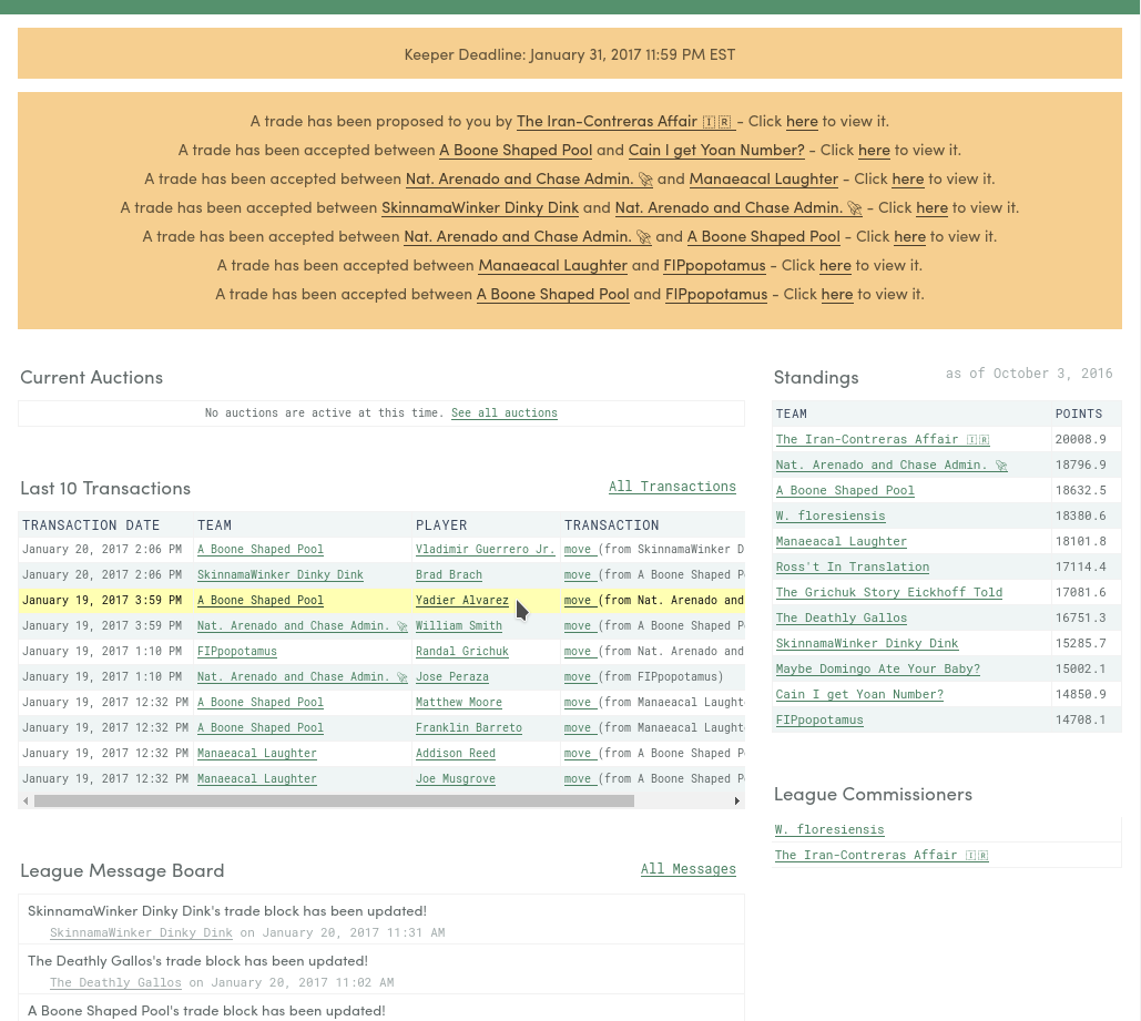
Screenshot of what my league home page looks like now:
CSS:
body {color: #626a6a;}
main {margin-top: 12px;padding: 0px 16px;}
a {color: #4b8162;}
table {font-size: 12px;}
td,th,table {white-space: normal;border-color: #f2f2f2;}
th,td {padding: 3px;}
tr.even {background-color: #eff5f5;}
.messages-item {padding: 4px 8px;font-size: 13px;}
h4.messages-byline {margin: 0px 4px;font-size: 11px;}
.messages-list {border-color: #f2f2f2;}
li.messages-item,li.messages-item:not(:last-child) {border-color: #f2f2f2;}
li.messages-item p {margin-bottom: 4px;}
.section-container-header {border: 0px;background-color: inherit;padding-left: 2px;}
.section-container-header h3 {padding: 0px;}
main #notifications {margin-bottom: 20px;line-height: 18px;}
main #notifications p {margin: 0 0 8px 0;}
main .notifications {margin-bottom: 12px;}
main .sidebar-layout__primary td {white-space: nowrap;font-size: 10px;}
main .sidebar-layout__secondary table {border: 0px;font-size: 11px;}
main .sidebar-layout__secondary td {border-color: #f2f2f2;}
table.lineup-table {text-align: right;width: 720px;}
table.lineup-table td.player-name {text-align: left;}
tr:hover {background-color: #ffffb3;color: #111;}
tr:hover a {color: #264031;}
#cutPlayers td, #hitters td,#pitchers td {font-size: 13px;}
1 Like
same thing for me.
Niv,
Not sure if this has been mentioned but where does that me find the point scoring info for FGP and sabr that used to be on faq?
wow. typo king.
Basically, Niv, I cant find ANYWHERE on the site where it explains how FGP por SABR points are scored. this used to be in FAQ, but I can’t find the FAQ, This is very important, IMO.
Anyone else having their messages disappear? I can see the responses from the other teams, but my messages to them are not appearing in the log.
1 Like