I along with most of our league do not like the updated layout of the score screen. It’s much harder to glance and get an update of what the status of the game is. Anyone else feel that it was better / easier to read before?
1 Like
On mobile it looks like this:
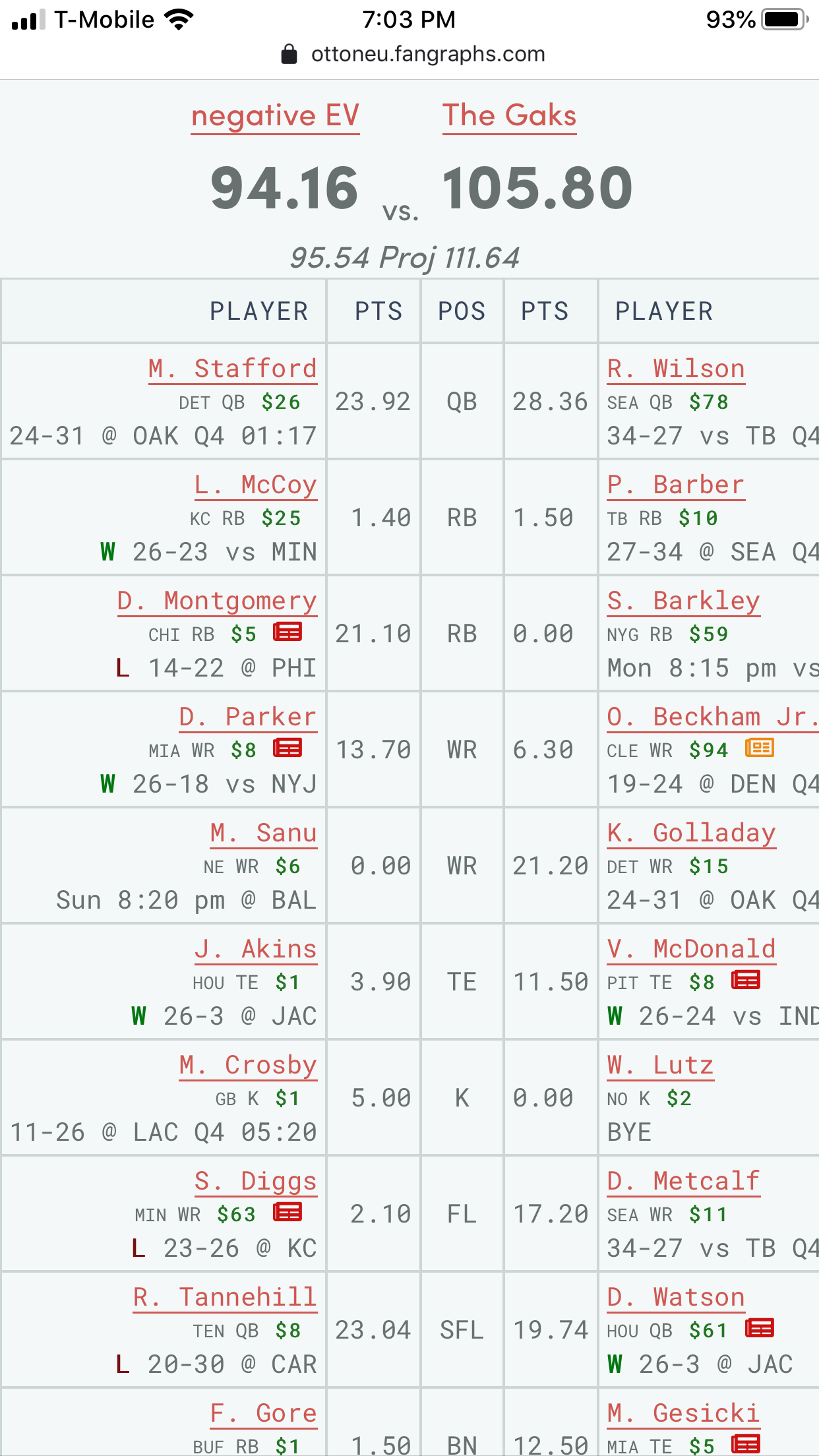
I find this to be much easier and more clear at a glance than the old page. Desktop has a similar layout with more information on it. Does it not look like this for you? Or how is this view not clear?
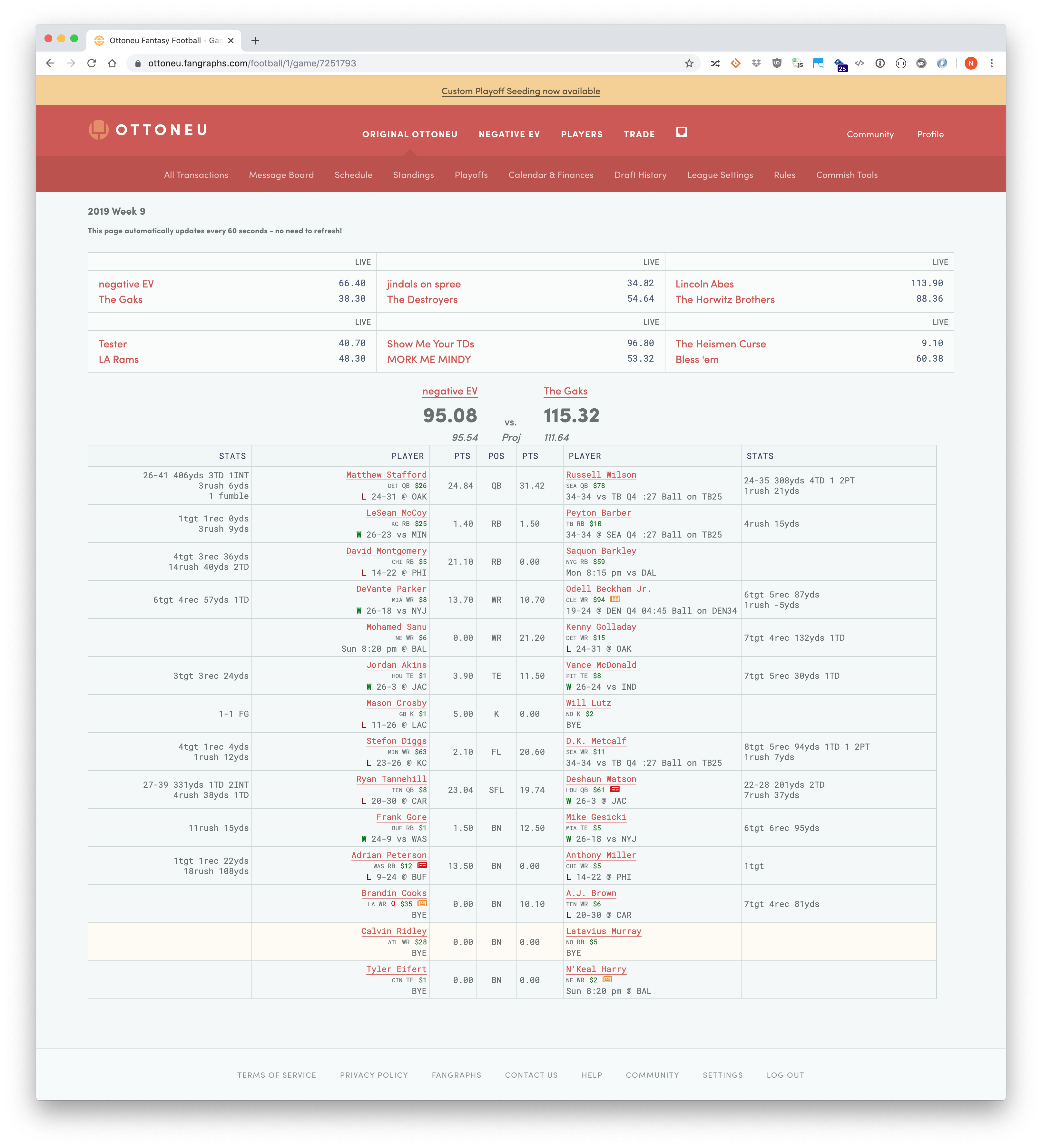
This is my desktop view
If this is not what you guys see, let me know. If there are specific things about this page that are confusing, again just let me know and I’ll do what I can to rectify it this week.
Personally, I like the new mobile better but prefer the old version on desktop. Would it be possible to display it differently depending on mobile or desktop? Or maybe make it a user option?
Adding an option for every preference isn’t really sustainable. What did you like more about the old game page on desktop?
There’s also the very real possibility that it might just require getting used to the new game page, which has been out for about a week. I borrowed heavily from elements on other fantasy football sites, so I think this is a pretty good solution as it stands, since it works for other major providers.
I find the new score screen difficult to read as well.
On mobile, there are no stats whatsoever. Using the mobile image above, it’s impossible to tell how Stafford scored those 23.92 points. Yet, there’s IRL game scores and time remaining, which aren’t all that important for fantasy.
On desktop, it’s really hard to compare scores against your opponent or match up your own stats-to-points.The middle POS column makes sense, with the PTS column spread outward again making sense. But then the PLAYER column is massive, especially when there are games going as in the image above, and the large column breaks up the “reading flow” by the time you get to the STATS column.
It just ends up being a lot of blank, white space for temporary “Ball on TB25” info.
Swapping the PLAYER & STAT columns would be ideal IMHO. Having points and stats right next to each other, without looking around everywhere, is key. The player and especially the game time situation are all minor details when I’m looking at the score screen.
1 Like
I think time remaining is more important than stats, in that time remaining during a live game indicates that there is still potential for more points to be scored. I’m not sure why on Sunday it matters how the points were scored. I can understand it mattering when the games are not live, as a way of evaluating your team, but I guess that’s the open question: is a specific game page being viewed more when NFL games are happening or after NFL games are done, and should there be a different priority of what to show accordingly. The redesign was optimized for what I think people will care about while games are on-going, less so about evaluating how your players are doing.
On desktop, the width of the player column is definitely worth examining, bringing everything tighter there should help a lot. I’ll investigate that now.
1 Like
I’m experimenting with some ideas on condensing the information on desktop and I’ll investigate adding game stats to the mobile view. I should have something shareable Monday at the latest. Please let me know how you use the game screen (scanning during NFL games or evaluating players after games or both?) and any other thoughts similar to what @Goob shared. That’s some good actionable feedback right there.
Thanks!
1 Like
Thanks @niv! Mobile stats would be my top wish, just ahead of narrowing the players column on desktop. I agree time remaining is an important stat too, I wouldn’t want it banished.
“I’m not sure why on Sunday it matters how the points were scored.”
For me, it’s huge. Take Beckham, Golladay, and McDonald in the image above. If I’m quickly glancing at the points, clearly Golladay had the best day. But the targets, receptions, and yards are key. Was the player involved but under-performed via drops? Did the player score all his points on a massive, huge play like Golladay might have? Odell and Vance had very similar scores, yet it’s clear Vance was peppered with short passes while Odell was doing the normal deep balls.
All of that informs my internal “did I start the right guy?!” debate that’s always raging for me on for Sunday. 
It’s similar for my opponent. Am I getting beat because his studs are studding? Or is he having a fluke week where lots of players are breaking free on garbage / boom plays against me? David Montgomery is a good example - 21 points is great! But he didn’t have a Zeke-like “stuff it down your throat” type of game with just 40 yards. Knowing that he was catching passes and possibly vulturing some goalline TDs tells me important info.
Come Tuesday or Wednesday, I’m rarely looking back at my previous week’s decisions, but instead looking towards the next slate of games.
This could totally just be me though, I’m interested to hear from others!
1 Like
I’ve rolled out a few changes to the game score page to try to address the concerns raised in this thread.
- The current score / game situation for each player’s NFL game now takes up less space on mobile and desktop.
- All the text is now left-aligned; I believe this makes the page easier to scan and less like a big blob of indecipherable text.
- On desktop, the amount of whitespace has been reduced and the stats have been brought closer to the rest of the information on the page.
I haven’t come up with a good solution for full stats on mobile. I believe this is a secondary concern on mobile compared to simply knowing what the players have scored and if they have potential to score more points. However I understand that many of you would like to see full stats all the time, and I’ll continue to explore how to address that concern.
As always let me know what you think and please share your thoughts on what you want from the game page if it hasn’t been brought up already.
1 Like