Any chance we could fade out the “Click to add a Target” link on the Roster Organizer, or maybe make it a different color (light gray?) to help better visualize potential empty spots on a roster?
Never thought about it before.. but it makes perfect sense.
The “Click to add a Target” language is really clunky and I agree, it doesn’t at first glance make it obvious where the gaps are in your roster.
I’m looking at this today.
1 Like
Went ahead and pushed a small change.
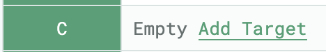
This makes it a lot easier to differentiate empty slots from ones with players in them on the Roster Organizer, and it has the added bonus of being pretty consistent with the same treatment on the lineup page.
Genie badge for @ichirosamba
1 Like
That does the trick. Thanks, Niv!
1 Like