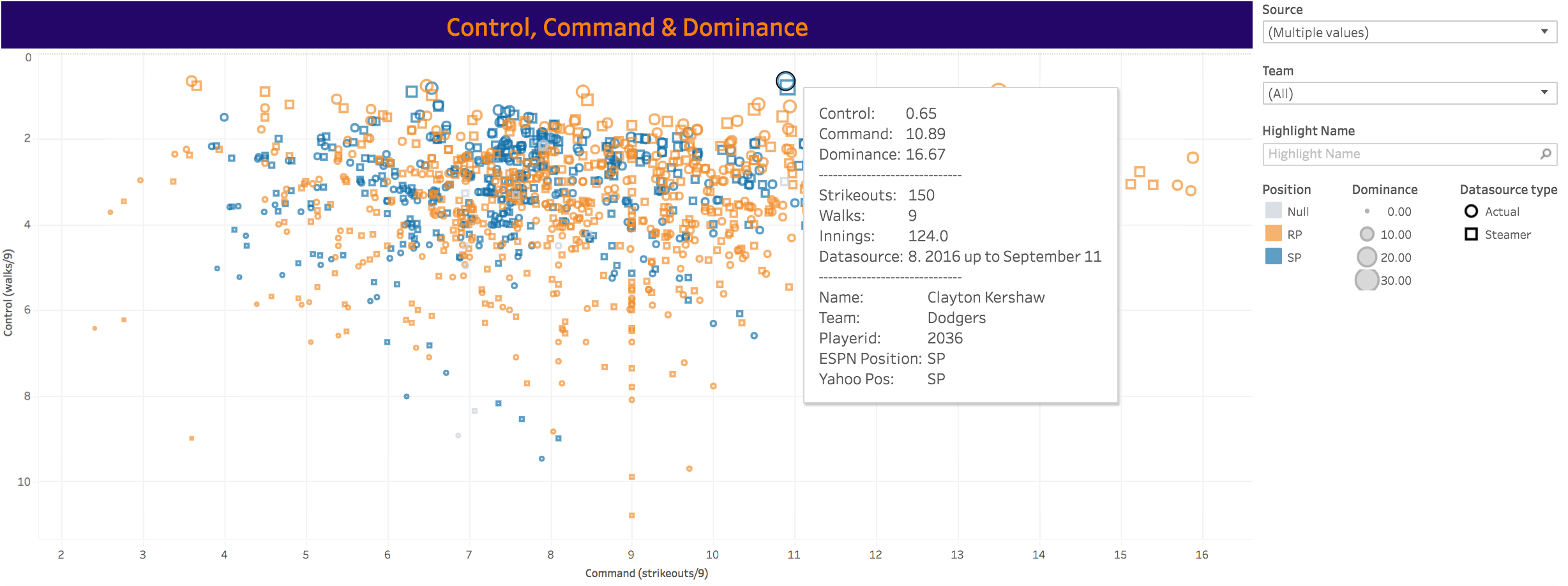
I created a fairly simple but interesting dashboard using Tableau 10. It shows MLB 2016 season pitcher data, looking at Control, Command and Domination (per BaseballHQ/Forecaster). The used datasets are snapshots of actual Fangraphs data during the season so far (roughly 1 or 2 per month), as well as Steamer Updated at those dates. Last snapshot is from September 11.
The Dashboard should work on Desktop and iPhone6, and has a “static” graph as well as an animated version in the second tab.
Check it out here