This was a reply in regards to adding the pitch count:
“This addition is nice but it brings up something I have been mulling for a while which is that it pushes the most important columns even further to the right. This would be FP and FP/G. I would like to see FP and FP/G columns moved to the left of the other stats since that is really the stat I look at most often. I would also ask the same on the “next 7 days” view, have FP/G and FP moved to the left of the schedule. Its a pain to look at the schedule while scrolling to the right to also compare FP values.”
And then another post:
“I didn’t realize on mobile it didn’t show the stats, but I work mostly on my laptop and with a small screen it is quite inconvenient to have to scroll to the bottom just to scroll right in order to compare FP/G on the 7 day view. When scrolling right you also sometimes lose sight of which pitchers you are even comparing.”
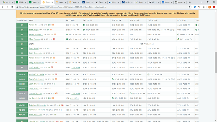
Here is a screenshot of my Desktop PC with a 27 inch monitor on 1600x900 resolution.
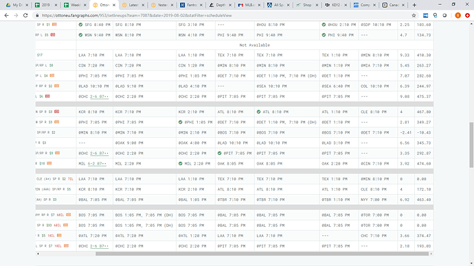
As you can see the problem is compounded by the double headers, but to see FP stats while looking at projected starters, I would first need to scroll down to even see the scroll bar and then scroll over to see the stats. Screenshot below.
As you can see, by the time I do that its hard to see who I am even looking at as well as the column headers. I primarily use FP stats to determine which 10 (or less) starts I will be using that week. I know the problem is worsened by the double headers, but the same will apply especially if on my laptop with a 14 or so screen.

