The tip of the iceberg on the baseball redesign can now be seen. Visit ottoneu.fangraphs.com while logged out - either log out or visit in a private browsing session.
You can see the direction we’ll be going, as well as the new logo. Lots more to come on this front soon.
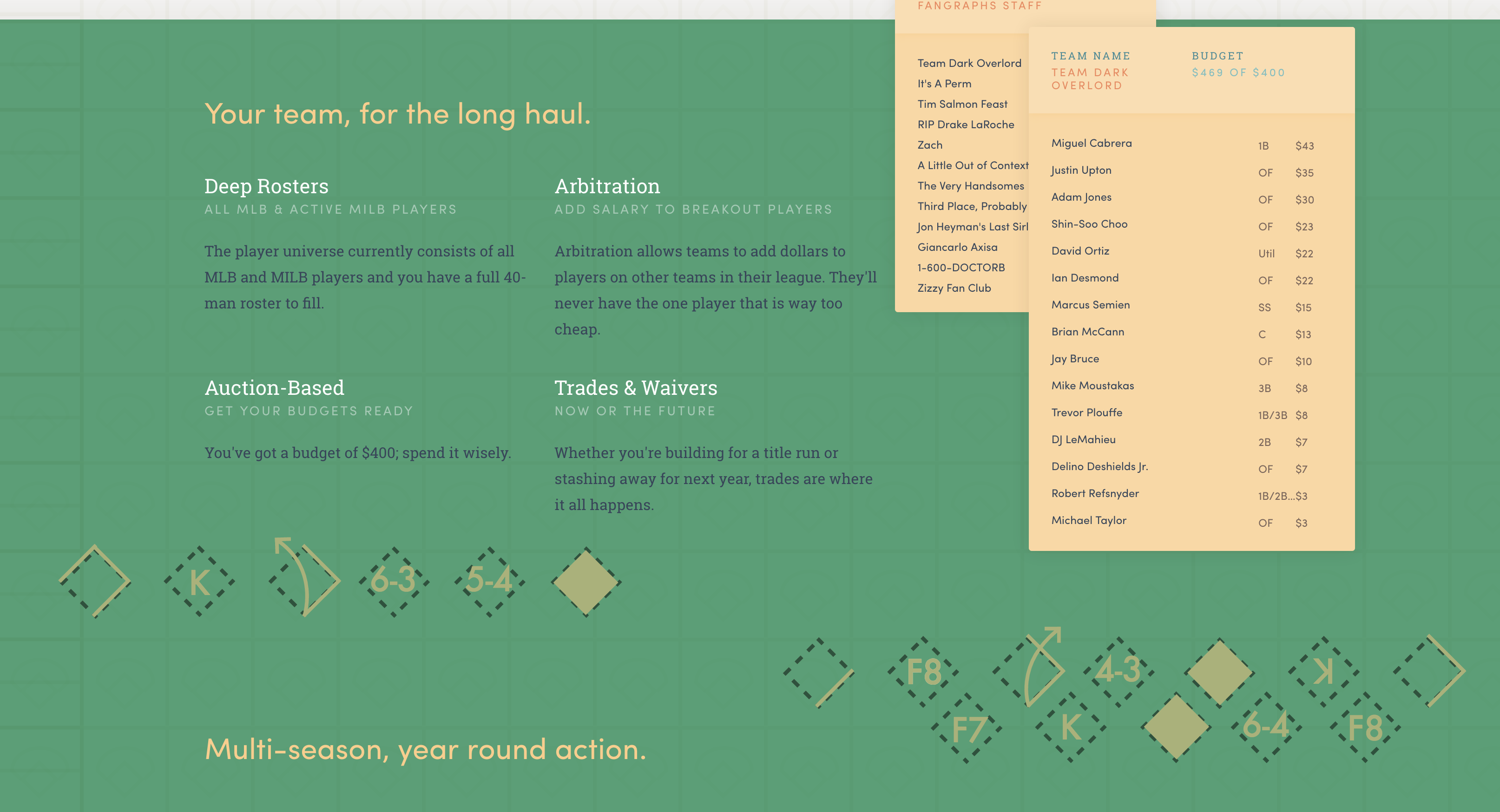
Minor nitpick, the graphic on the right hand side showing the roster of “Team Dark Overlord” has a format of Player/Salary/Position for the first two players (Miggy and JUpton), but then switches to Player/Position/Salary for the remainder.
A few very, very minor notes - on content rather than design:
You have Ortiz down as an OF (and should he even be there anyway?)
Team Dark Overlord are overbudget - I wonder if that might confuse people who are new to Ottoneu
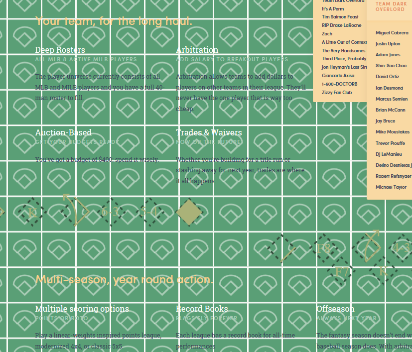
On the ‘Deep Rosters’ section: the section is headed ‘Deep Rosters’ but in the copy it says you ONLY have 40 roster spots. I know you are trying to draw a contrast between the entire universe of MLB and MiLB and your roster, but I think you should be playing up the 40-man roster not seeing it as being limiting
Under ‘Trades & Waivers’ you talk about ‘building for a playoff run’ - but (to my knowledge!) there are no playoffs in Ottoneu…
Under ‘Arbitration’ I’m not sure you can ‘assign a new value’ to breakout players. I think ‘Add dollars’ might be better
Niv, let me first say it looks great. I have always really like the existing design of Ottoneu, but this new one makes me hope you can implement it soon. But a bit of feedback on the design aspect: the readability of the text is very low:
I would suggest either make the green or blue diamond background images transparent , or but a grey transparent box behind the text, but ultimately I don’t think the green and blue diamond images add anything, other than making everything else hard to read. I do really like the score card images here and there.

 - seems cool!