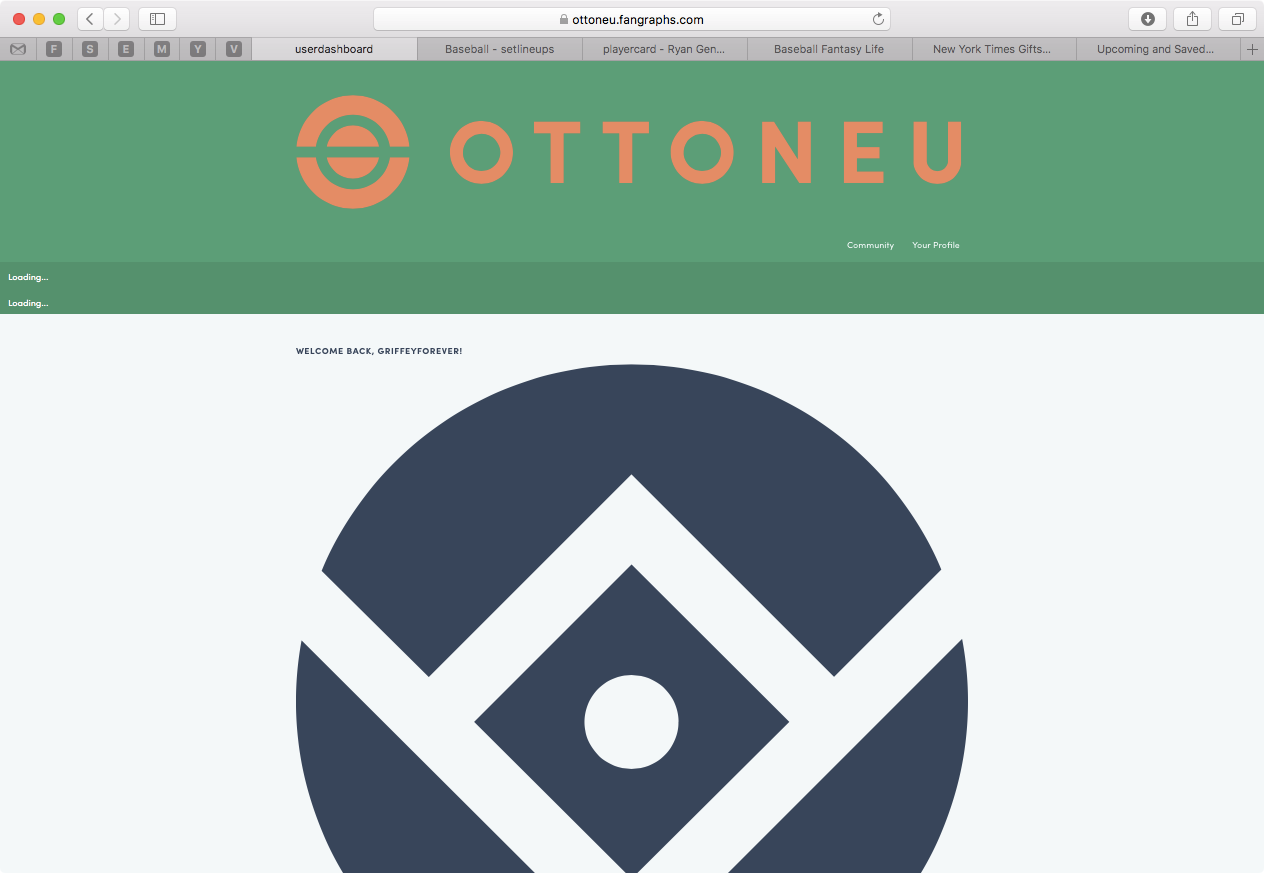
The user dashboard has been updated to reflect Ottoneu Fantasy Sports branding. There’s now a ticker for recent football transactions in addition to the baseball ticker, and the colors on the page have been updated.
In making this change, I’ve also changed the “logo link” on football pages to point back to the main dashboard, for those of you who play both football and baseball.
I agree there is more that can be done on this dashboard, so consider this a first step to reconsidering this experience. More to come!
UPDATE As I mentioned lower down in the thread, I also used this opportunity to implement @Henry.Woodbury’s suggestion of reducing the header size to what I think is great effect.
Nice look! Like the introduction of the dark blue branding color.
I have to say, I like the narrower banner on this community site. I would love to see something like the right-hand menus above integrated into the ottoneu design to replace the current “commuity” and “your profile” links.
That is a good amount of wasted space, let’s see what we can do.
UPDATE Ok well that was a no-brainer. The header has significantly less padding across all Ottoneu pages, which I think will be a VERY WELCOMED change.
Great addition. I’ve noticed the speed of the football ticker is faster than the baseball one. I actually prefer the higher speed of the football version. This may all be by design, just thought it was interesting.