The first iteration of the football redesign is now live. You can check it out at ottoneufootball.com.
This is just phase 1 - a number of things aren’t completely polished yet, the responsive design hasn’t been tackled, and a little bit of color will probably be introduced to various elements on the page. However, it gives a good indication of the new design direction - less noise, and more focus on what matters, which is your fantasy league.
We’ll continue to improve the football design and baseball will undergo a similar process before next season. Please share your thoughts (as constructive as possible!). I’m really excited about this project - I really think it will improve the experience of playing ottoneu games, and I hope y’all agree!
Big fan of the simplicity. Looks great on my laptop. It’s a little squished on my phone - I have to scroll to the right to see some of the info. There seems to be a lot of space between the text, so the mobile formatting could use some tweaks I’d say. But overall I think it’s a win!
First impression is that things look great @nivshah, very clean. You mentioned adding a bit more color eventually, and that’s really my only criticism (other than possibly some visual separation between some of the elements with stronger bolding or lines).
I approve of the design. I have a couple comments for you, @nivshah, pertaining to the SEO, code, and content side of things, but huge improvement and great opportunity to get some new owners into the Ottoneuiverse!
I love the new look! I’d say overall it’s an improvement from the previous version. I will agree that there is too much white (maybe add a darker “nighttime” theme?). Adding some color could really spruce it up. I also feel like there is a lot of open space on each page. Maybe condense the text down a little to make the dead space be more on the sides. This could also help for those using their phone to make changes to their team. Great work so far!
I really do enjoy the design now, but on my monitor the amount of white is actually really blinding. If there could be a way to tone down the brightness on the page or perhaps like Waynus suggested a “nighttime” theme, that would be great.
Hey Niv, love the new direction and style. My only big comment is to echo a few above who said a little extra color could help make the different sections clearer - I think it would help for example on the team page to set apart the team roster, cap penalties, loans, etc. But it sounds like that’s already in your plans. Very cool, I’m excited to see the final product!
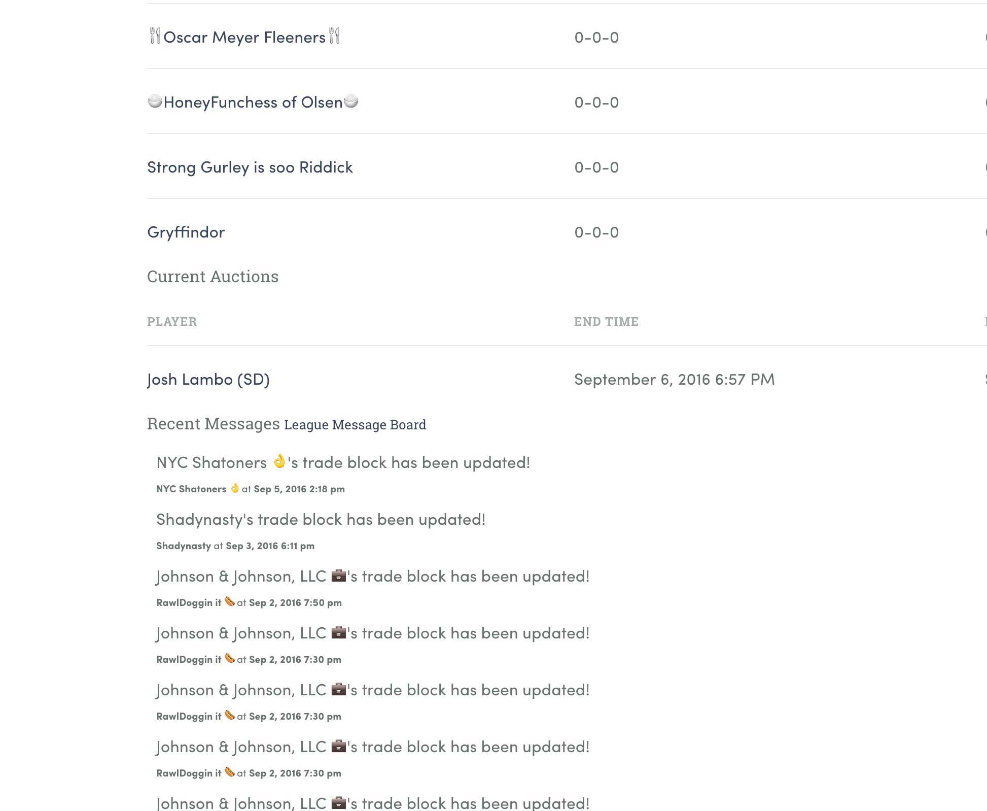
Hey Niv, noticed one small thing - on the trade page, there’s something funny happening. Looks like the position column stays in one place, but players with a long name bleed into that column, so it can be a little hard to read. Not a big deal, just letting you know as you work on stuff!
Also, one other comment now that I see the lineup page is live, it seems to extend quite far down the page. Idk if there is an easy way to do this but I think it would be a little easier if more of the lineup page fit above the fold on the monitor - that way you can see your bench options and lineup at the same time.
Having used the UI a bit now, I really have to voice my displeasure. I get the aesthetic you’re shooting for, but the demarcations between what text is just text and what text is actually a button is almost non-existant. Same goes for areas that are text fields, it basically just looks like a header and then the same white background.
Perhaps the addition of more color makes these issues slightly less glaring, but the lack of obvious things to click to do things would probably not be solved by such a fix. Right now, this feels vastly inferior to the current UI for baseball.
This is pretty fair feedback, and I’ve run into a lot of those issues using the new site myself (my team). Like I said in the beginning of the thread, this is just phase 1, and using it has given me a lot of specific direction to give in phase 2.
It’s a bit hard to tell when one section ends and another begins (screenshot). Some grey background colors to create headers or make sections stand apart might help.
I also miss the alternating row background colors in all the tables.
Is anyone else having a hard time seeing stat lines and total points? For example, Cam Newton’s stat line bleeds over his total points so I have no idea what he scored. Just a thing I noticed.